Fewer Numbers, Better Decisions: The Executive's Case for Radical Metric Discipline

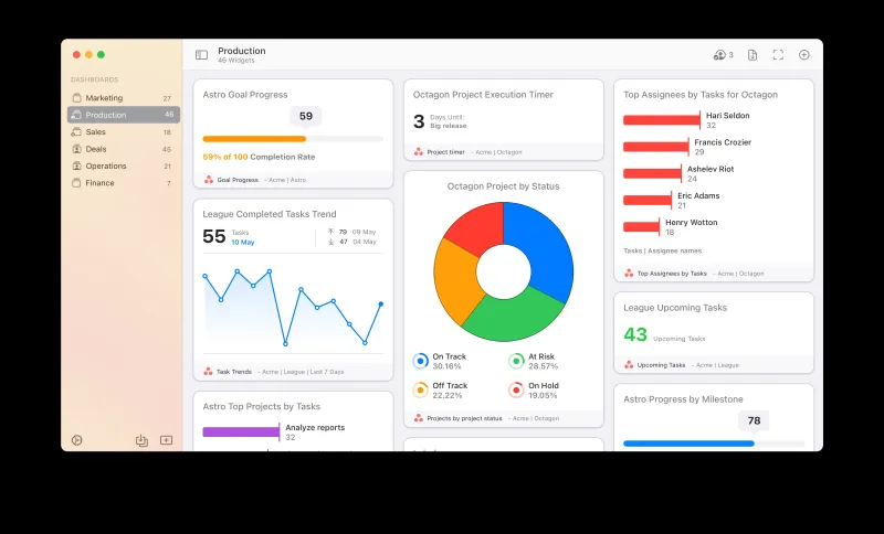
Let me describe a scene that will feel familiar to many readers. A leadership team convenes for its weekly business review. The deck contains forty-seven slides. Seventeen of them are dashboards. The dashboards collectively display 200-plus metrics. By slide twelve, the conversation has drifted from strategy to arguing about whether a particular metric should be calculated inclusive or exclusive of a specific customer segment. The meeting ends ninety minutes later. Nothing has been decided. The business moves forward on inertia.
This is not a technology failure. It is a philosophy failure. And it is costing American companies—in leadership time, in strategic clarity, and in the quality of decisions that actually get made—far more than the cost of the analytics tools that enabled it.
The Paradox of Measurement Abundance
For decades, the dominant aspiration in business analytics was more: more data, more metrics, more dashboards, more visibility. The aspiration was understandable. Leaders who had operated with insufficient information logically concluded that more information would produce better outcomes.
What they did not fully anticipate was the cognitive cost of abundance. Human attention is finite. When a leadership team is presented with fifty metrics, it cannot give meaningful attention to all fifty. It will, predictably, focus on the metrics that are most visually prominent, most recently discussed, or most politically charged—not necessarily the ones most consequential to business performance. The important signal gets buried in the volume of noise.
This dynamic has a name in behavioral economics: information overload. Its effects on decision quality are well documented. Beyond a threshold of information volume, additional data does not improve decisions—it degrades them. More metrics do not produce more clarity. Past a certain point, they produce less.
The Common Traps That Fill Dashboards With the Wrong Numbers
Understanding why organizations accumulate low-value metrics is essential to the discipline of eliminating them. Three patterns account for the majority of metric bloat.
The Activity Trap. Organizations frequently measure what is easy to count rather than what is consequential to count. Website sessions, emails sent, calls made, reports generated—these are activity metrics. They are trackable, which makes them feel informative. They are not inherently connected to outcomes, which makes them strategically misleading. A sales team that made 500 calls last week and closed zero deals has impressive activity metrics and a serious performance problem that those metrics obscure.
The Accountability Trap. Metrics are sometimes added to dashboards not because they inform decisions but because they assign visibility to a department's work. Marketing wants its metrics represented. Operations wants its metrics represented. Each addition is justifiable in isolation. The cumulative effect is a dashboard that reflects organizational politics rather than business drivers.
The Vanity Trap. Vanity metrics are those that trend positively and feel meaningful but carry no reliable relationship to revenue, retention, or growth. Social media follower counts, raw app downloads, and page view totals are classic examples. They are satisfying to watch climb. They are poor predictors of outcomes that matter to shareholders.
What a High-Signal Metric Actually Looks Like
A metric earns its place on an executive dashboard by satisfying three criteria simultaneously.
First, it must have a demonstrated empirical relationship to a business outcome that leadership cares about—revenue, margin, retention, or growth. Not a theoretical relationship. A demonstrated one, verifiable in the company's own historical data.
Second, it must be actionable within a meaningful timeframe. If a metric changes and leadership cannot identify a specific intervention that would move it, the metric is informative but not decision-relevant. Decision-relevant metrics connect directly to levers that the organization can pull.
Third, it must be owned. Every metric on an executive dashboard should have a named individual accountable for its performance. Unowned metrics become background noise. They are observed but not acted upon.
Applying these three criteria rigorously to a typical executive dashboard will, in most organizations, eliminate between 60 and 80 percent of the metrics currently displayed.
Building the Core Five to Seven
The number five to seven is not arbitrary. It reflects the practical limit of what a leadership team can hold in active strategic attention simultaneously. Fewer than five may leave genuine blind spots. More than seven consistently produces the attention diffusion that undermines decision quality.
The process of identifying the right five to seven is analytical, not political. It begins with a simple question: over the past three years, which measurable variables have shown the strongest correlation with the outcomes we care most about?
For a subscription software company, the answer might be net revenue retention, product activation rate within the first thirty days, and expansion revenue as a percentage of total revenue. For a regional distribution business, it might be on-time delivery rate, order fill rate, and gross margin by customer segment. For a professional services firm, it might be utilization rate, average project margin, and client renewal rate.
The specific metrics are less important than the process of identifying them empirically. The right metrics for your business are in your data. They are not in a best practices list.
The Discipline of Subtraction
Adding metrics to a dashboard is easy. Removing them is genuinely difficult, because every metric has a constituency. The department whose KPI is being removed will object. The analyst who built the report will advocate for its retention. The executive who requested the metric two years ago may feel that its removal implies their original request was wrong.
These are real organizational dynamics, and they require explicit executive sponsorship to overcome. The discipline of metric reduction is, at its core, a leadership act. It requires the authority and willingness to say: this number is not driving our decisions, and its presence on our dashboard is costing us clarity we cannot afford to lose.
Organizations that have undertaken this discipline—formally auditing their metric landscape, applying rigorous selection criteria, and reducing their executive dashboards to a focused core—consistently report two outcomes: faster decision cycles and higher leadership confidence in the decisions being made.
More Data Is Not the Same as More Intelligence
The aspiration that built the modern analytics industry—that more data produces better decisions—was never entirely wrong. Data matters. Measurement matters. The problem was the implicit assumption that more was always better, that the relationship between measurement volume and decision quality was linear and unlimited.
It is not. Decision quality is a function of signal clarity, not data volume. The executive who tracks seven metrics they trust completely will consistently outperform the executive who monitors two hundred metrics they half-understand.
The most powerful analytics question an organization can ask is not: what else should we be measuring? It is: which of the things we already measure actually tell us something true about where we are going? Start there. Build from there. And resist, with discipline, the instinct to add.